 |
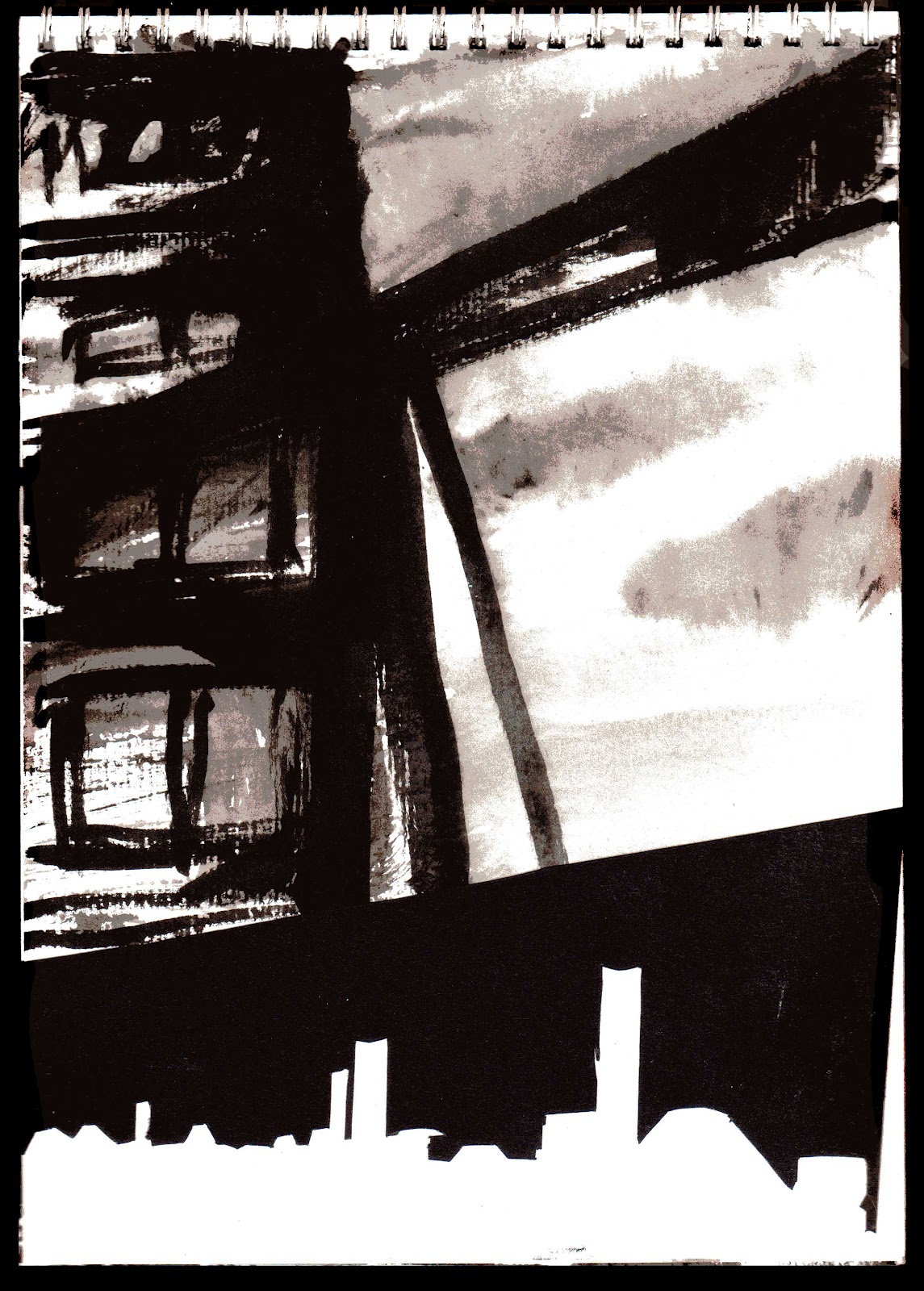
| Image 1, ink and paper cut |
 |
| Image 2, Ink and paper cut |
 |
| Image 3, Stencil |
Image 1 is further experiment from one of my earlier sketches.
(See earlier post) I decided to cut the buildings out of black paper and collage them onto the ink painting of the smoke. I had previously thought it would give the image a more graphic edge in order to break up the painting within the narrative. I think it works well, the buildings have a definite man made edge to them in contrast to the organic freedom of the smoke.
 |
| Image 5 , stencil |
Image 2 I decided to take the off-cut of the previous buildings and collage them over a quick painting. This was to attempt to create some white space with a similar clean edge. Again I think this is effective (though the bottom could be cropped a little more). I feel with these two techniques I will be able to create dynamic looking images, keeping the narrative visually interesting.
 |
| Image 4, stencil and ink |
With images 3-5 I experimented with stencils. The idea was to create depth by blurring the buildings that are further in the distance. The stencils created a straight edge, but with some bleeding from the paint they became a little more blurred. The stencils also, I feel, created an industrial feel with their broken edges. They are very messy and only a quick experiment, but I feel it was worth doing as they definitely have the right atmosphere about them.


No comments:
Post a Comment