

A Blog by Claudia Whiting documenting my Final Major Project (Southampton Solent, Illustration)
Monday, 30 April 2012
Sky Textures
Lights and Explosions


I painted some potential 'lights' for my light house flare. I used inks because I like the translucent effect the have. The red came out as a really vibrant magenta, and, to be honest, I think I prefer this colour to a brilliant red. it is slightly different to what you would expect from light, or and explosion, so I think I will stick with it!
The explosion images were, like the other textures I have created, made with water and ink. I love that they have an organic feel to them, yet also a raw energy, as the mark making is out of my control once the ink touches the water. I think this will work well with my idea of an 'organic' looking explosion!

Textures


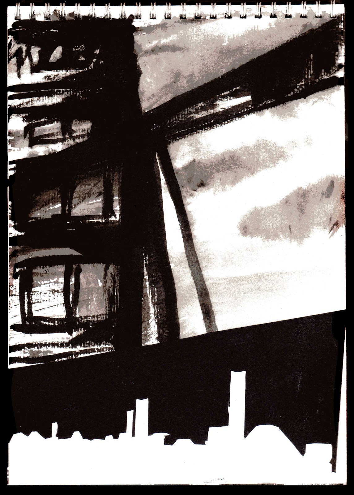
Sunday, 29 April 2012
Week 10 Summary
I created some interesting experiments this week, working on the background scenery, textures and depth.
I feel like my weekly summaries have become redundant now. I will keep them short, as the information needed is within all the posts before. I don't want to be just repeating what I have previously said. However I will still link to each week for easy of navigation.
I feel like my weekly summaries have become redundant now. I will keep them short, as the information needed is within all the posts before. I don't want to be just repeating what I have previously said. However I will still link to each week for easy of navigation.
Thursday, 26 April 2012
Collage
 |
| Image 1 - Photo collage and ink |
 |
| Image 2 - Photo collage and ink |
 |
| Image 3 - Photo collage and ink |
Ink, collage and stencil
 |
| Image 1, ink and paper cut |
 |
| Image 2, Ink and paper cut |
 |
| Image 3, Stencil |
Image 1 is further experiment from one of my earlier sketches. (See earlier post) I decided to cut the buildings out of black paper and collage them onto the ink painting of the smoke. I had previously thought it would give the image a more graphic edge in order to break up the painting within the narrative. I think it works well, the buildings have a definite man made edge to them in contrast to the organic freedom of the smoke.
 |
| Image 5 , stencil |
 |
| Image 4, stencil and ink |
With images 3-5 I experimented with stencils. The idea was to create depth by blurring the buildings that are further in the distance. The stencils created a straight edge, but with some bleeding from the paint they became a little more blurred. The stencils also, I feel, created an industrial feel with their broken edges. They are very messy and only a quick experiment, but I feel it was worth doing as they definitely have the right atmosphere about them.
Wednesday, 25 April 2012
Text and Explosion
 |
| Printer ink on acetate |
 When trying to create my text on a circle on acetate, I realised my printer wasn't capable of printing on it! This led to the ink running everywhere. I thought I would leave it to dry and when I cam back it looked like this! It was almost like a cabbage leaf print! I thought it would perhaps work well as an organic looking explosion, so I printed the ink onto a piece of paper. I later scanned it in and layered it over the top of one of my building paintings. I thought it looked quite impressive, but when printed out the red had lost it's vibrancy and was difficult to see. On discussion with Ceri she said she didn't read it as an explosion at all. I will now try to create some organic looking explosions using inks I think.
Tuesday, 24 April 2012
Work in Progress
I have to admit to being unimpressed with this work in progress session. Naturally it was done in alphabetical order, and being a 'W' I was the last to show my work. In theory it should have been very helpful, we were asked to take notes on what the tutors said about the work of the person to our left. That way we could listen to what they were saying whilst someone else was noting it down for you to re-visit later.
However, being the last person, and having a fair amount to show, I really didn't get the feedback I wanted. I felt like I was being rushed through my explanations and images weren't looked at or considered properly. My feedback notes consisted of one line - more images in the mock up book, which I feel is a fairly obvious thing to point out.
So I feel at this point in time I am either fantastically on track or flying off the rails. Who knows. I will arrange a one on one tutorial soon to find this out.
Experiments with Depth
 |
| Image 1 |
 |
| Image 2 |
 |
| Image 3 |
Sunday, 22 April 2012
Week 9 Summary
I have to admit to losing track of the blog this week, I will post some of my images up later in the week. I have found that now I am getting into my project, stopping all the time to update my blog is really distracting. I found it useful at the beginning when working through ideas, but now I am finding it a chore to keep scanning in my images and updating.
That aside, a post summary for this week shows much of the same as last week. I have been continuing to experiment with the photographs I have taken, trying to find other ways to represent my robot character if the photo collage doesn't work out. I am still working with the idea of using the figure as a container for mechanical parts. More will be updated on this later.
 |
| Container study |
That aside, a post summary for this week shows much of the same as last week. I have been continuing to experiment with the photographs I have taken, trying to find other ways to represent my robot character if the photo collage doesn't work out. I am still working with the idea of using the figure as a container for mechanical parts. More will be updated on this later.
Friday, 20 April 2012
Presentation Document Tutorials
Just a quick entry on the presentation document tutorial. As far as I could tell, everything was looking alright. I was told to make sure that I always link to my final major project, but I was sure I was doing that already anyway? I will re-read my posts just to double check everything is explained correctly. I have found that there is a lot to remember for each post, and though it is supposed to be a simple diary of what you do, I feel the whole thing has a much more of an academic focus then it should.
Tuesday, 17 April 2012
Catalogue Image Selection
We were asked today to bring in a selection of images to choose one to use in the Degree Show Catalogue.
I was pretty certain that I wanted to use one of my recently edited photographs. Luckily, Ceri agreed with me. The image I chose was this;

to fill and A4 double page spread. I think it will be very striking and am pleased I was able to use it!
I was pretty certain that I wanted to use one of my recently edited photographs. Luckily, Ceri agreed with me. The image I chose was this;
to fill and A4 double page spread. I think it will be very striking and am pleased I was able to use it!
Monday, 16 April 2012
Paper cuts

I wanted to experiment with cutting into black paper to give my narrative a more graphic edge. Whereas some of the figure drawing looks good in the direct ink paintings, I felt that perhaps some of the building were suffering. I will continue to cut more scenes and perhaps combine ink with cut paper.
It may be a useful mode to create pace within my narrative, using the graphic paper cuts as the focal point and the ink paintings as objects that are out of focus. Some of the scenes I have planned are built up with images that could almost be used as animation frames, so a cinematic approach to foreground and background focus may work well.
I will create a collage in this style and discuss the outcome later.
Sunday, 15 April 2012
Animation
I quickly placed the previous images into an animation in Photoshop. Though the affect was interesting, it is not something I will be continuing with, it was just interesting to follow the idea through and see the outcome!
Shadows and Containers

 Having
worked during my life drawing session with shadows and line, I decided
to go through my photographs and choose all of the relevant positions
and work out the light and shadow.
Having
worked during my life drawing session with shadows and line, I decided
to go through my photographs and choose all of the relevant positions
and work out the light and shadow.I felt this was necessary as it would be a guide later for and paintings, and would be incredibly useful for planning out paper cuts.

The images themselves came out interesting though, I like the succession of changing positions, and I like the grouping of the figures together.
 The
black and white continues the theme of containers, It would be
interesting to place some images behind them and see how they come out. I
would, however, keep them as 4 separate images with all of the figures
lined up together, as I feel they would be interesting enough on their
own.
The
black and white continues the theme of containers, It would be
interesting to place some images behind them and see how they come out. I
would, however, keep them as 4 separate images with all of the figures
lined up together, as I feel they would be interesting enough on their
own.I also realised how similar to animation frames they looked. I will compile the images in Photoshop and create a small animation with them soon, just to see how it looks!
Easter Break Summary
Unfortunately I had to work over the Easter Break, as I had run out of money. This left me less time then I had intended to work on the project.
However, I feel that the life drawing session I set up, and the photographs from that session, have really steered my project in a new and exciting direction. I am not surprised to see how much my project has changed from my initial statement of intent, however I did not imagine I would be working with photographs!
I have to say at this point I am quite excited about how the final images will look, I may be exploring an area I haven't really worked with before, but i think it will be worth it for the experience!
 |
| Sketch from Life Drawing Session |
However, I feel that the life drawing session I set up, and the photographs from that session, have really steered my project in a new and exciting direction. I am not surprised to see how much my project has changed from my initial statement of intent, however I did not imagine I would be working with photographs!
 |
| Photograph from Life Drawnig Session |
I have to say at this point I am quite excited about how the final images will look, I may be exploring an area I haven't really worked with before, but i think it will be worth it for the experience!
Saturday, 14 April 2012
Collage and Painting


As mentioned earlier, I experimented with drawing directly onto photographs. I created some backgrounds by layering up ink, added collage on top, and then added any paint I felt necessary.
I was really pleased with the outcome of these, they have a very specific mood to them, and an almost industrial, grimy atmosphere.
As they are only sketches, it is possible that they could do with some refining, though I have to admit, I really like the areas where the ink has accidentally bled.
I like these images as pieces on their own, I think that they are very strange, but interesting! I will continue with the idea of Photo collage and paint and see where further experiments lead me.
As I had said before, I had taken photographs with the idea of collaging them into buildings. This is something I have only just started exploring, however I feel the outcome could be very successful.

Drawing on collage
 After printing out some of my photographs, I decided to begin drawing machine parts onto the images. This was an experiment to see how it would look to combine hand drawn and collage. I thought the effect was interesting, but the hand drawn element doesn't communicate correctly the idea of a mechanical man (all be it only a representational one!) I will perhaps use these in some full collage to see how they look, however I am beginning to feel that the photographs collaged in Photoshop are more what I am looking for.
I was really pleased with my previous photo collages in Photoshop, so I am of the mind to continue in that direction. I had initially intended to make a collage out of my paintings and textures, however, I feel my recent set of photographs were so successful, it would be a shame not to use them.
Thursday, 12 April 2012
Editing Photos


I thought I would play around with some of the photographs I took yesterday, collaging other photos I have collected throughout the project. Here are a few of the edited pictures.
I really liked how some of them came out, they have the atmosphere I was trying to create.
The position that Sam is in reminds me of a child in the womb, by combining it with machine parts (in this case it is actually a speaker cone), it is to represent the conception of industrial man.


The image also looks like a man reaching towards something, we can not see what it is, but the mood suggests a sort of longing.
I have to admit to really enjoying doing these, I will have to think it I will be able to use some photographs within my narrative.
As it stands as the moment, where my work is mostly very direct ink paintings, I am not sure that they will be compatible, I will have to create some collages to see how they interact.


Wednesday, 11 April 2012
Life Drawing
 |
| From Scene One, The Struggle |
 |
| From Scene One, The Struggle |
I found recently whilst planing out my narrative that I was struggling to get the positioning and pose of my figures right. There was only so much I could find via reference on line, so I decided the best thing to do was to arrange a life drawing session. I am lucky enough to have a friend (Sam) who works as a life model in Southampton, so I arranged a private session with him. I found it was great as I could ask him to pose exactly how I wanted! I had previously worked out the exact scene I wanted to illustrate.
The idea was of the character struggling to disconnect himself from a large pipe or cable. The idea was that the character would be disconnecting himself from technology.
The second scene I needed help with illustrated the character slowly crouching down to cover and protect a small plant. I wanted the frames to run almost as an animation to show this. Here are a selection of drawings from the day.
 |
| From Scene Two, Becoming Passive |
 |
| From Scene Two, Becoming Passive |
I also took some pictures to document the session and use later. I will discuss them on a separate entry.
Life Model Photography Session


I am particularly lucky in the respect that I have a friend who is a life drawing model. This gave me the opportunity to set up a session with him and ask him to pose for me! I set up a black background and some lights in order to get the most dramatic shadows possible. I am not good at photography as such, but I knew what I wanted to get out of the photographs. I was pleasantly surprised with how well they came out!

 It was great to be able to get exactly what I wanted out of his posing, as mentioned before I was beginning to hit a wall with my illustration of the 'struggle' scene as I had to reference for it.
I really needed my model to be fighting against himself to give the illusion of a struggle.
I took these photographs to use as a reference later on, however, as I have said I am pleased with how some of them have come out! I feel they will be more then useful for my project!
Subscribe to:
Comments (Atom)