Wednesday, 29 February 2012

Fold Out Pages

Image 1
Image 2
Image 3
Image 4

I began to play around with the idea of the city being built. I thought about how I could fold paper in such a way to show the illustration 'growing'. Images 1 to 4 show the steps I had taken. I had previously made a very rough sketch to map out how the folded images would connect, the painted this sketch to see how it worked.

I really like the idea of having fold out pieces in my book, even though it is only folded paper, it is in a way a mechanism, which in some ways goes with the themes I have chosen for my narrative. It could be that I am thinking too much about the meaning of the folded paper, but this was the idea I had behind  it. I doubt anyone looking through the finished book would think the same thing, but this is why I chose to do it, as obscure as it may seem!
Image 5
Image 6


Images 5 and 6 were rough designs for an explosion. I have been toying with the idea of Melpomenia being constructed and then deconstructed. The working methods for this idea seem endless, for example, I could start off with very clean precise drawings for construction, and then very messy, textured and worked into and over images for the deconstruction. It is something I will consider trying, however I want to keep a flow throughout the narrative and I don't want to mix too many different working methods.

I therefore set on the idea of an explosion, and thought that I could do a similar methods of folding paper as the explosion grows in magnitude over the city.

I think the next step would be to put these images in the context of a mock up book and see how they work as pages.
Early plan of fold out pages


Monday, 27 February 2012

Work on Self Promotion

Layout for the mini book
Self Promotion Sketch

I began working on my self promotional material today. I decided to use some of the images from my previous project so that I wouldn't feel too much pressure to create new images alongside the work for my final major project.

I decided to make a simple concertina book folded out of A4 paper. This should make production easy and cost effective. The construction itself is simple, fold the paper into eight equal sections and cut a line down the middle of the middle four sections. This enables you to fold the paper into a mini book.

Edited and finished Image
I felt the images would work well as they were illustrations of telephone lines. I decided to link the images together by creating a large image for the back of a telephone. This would mean the book also folded out into a mini poster, giving it more then one function.

I do, however, feel the image of the telephone is visually more exciting then the contents of the book. Perhaps I will need to re-think the contents.

In regards as to how this relates to my final major project, I have looked at different ways to create books and have worked in a similar style, using very direct ink painting and Photoshop.

Sunday, 26 February 2012

The Beginings of a Story

Having compiled my research, I began to get ideas for a story. I started making notes on ideas and came up with the basic plan of a figure, travelling through the city and finally protecting the last remaining plant.

I want to ultimately keep it ambiguous, in the sense that is it Earth in the future and therefore a social comment? Or is it just an entire work of fiction.

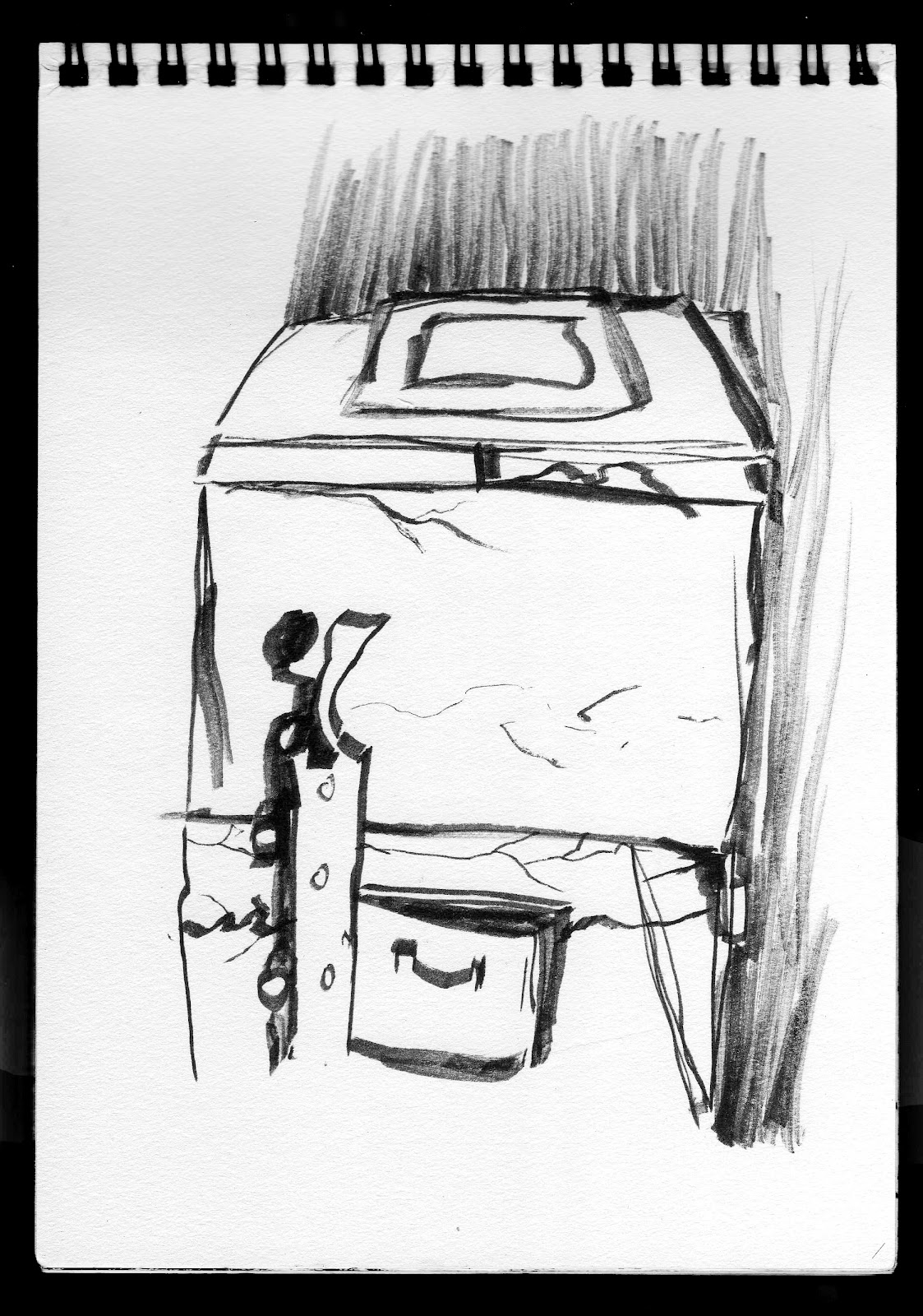
The figure I thought about illustrating as a robot type character, however I felt this looked incredibly cliched, so I decided to begin drawing it in a human shape. I think i will take this shape and use it as a container for mechanical parts, once again, keeping the image somewhat ambiguous. Is it a social comment on man and machine? Or is it just a robot in a science fiction setting?

For me personally, it is both. I like to keep it ambiguous so that the viewer will be able to decide for themselves. The challenge will be to make it easy to understand on both levels, or it could simply loose all meaning.

As I discovered with my last project, drawing figures without reference can look incredibly stiff and un-lifelike. I am not aiming for any form of realism, but I feel that in order to communicate my story visually with success, I will need to give my figures more of a sense or presence, movement and life. I will therefore begin working on some figure studies

Fender Amp

My Boyfriend recently took apart his 1970's Fender Tube amp, so I used the opportunity to get in their and take some pictures! There are some fantastic components, many of them reminding me of weird scifi skyscrapers. I would love to be able to collage them in such a way that they look like Science Fiction style buildings!

 I took as many pictures as possible, as, even though they look high tech, the components themselves are from the 70's and are now considered outdated technology (even though, in my humble opinion, they sound much better!).

This again fits in with my previous research, and will definitely be the angle I take on the project from now on. It would be nice for the final images to look futuristic (all be it futuristic in decay), but then one person will look at it and say, "Hey - isn't that a valve from a bass amp?" or something along those lines. I hope this way it will encourage the viewer to continue to read into the images.

 It's a shame it isn't in working order at the moment as I would have liked to have taken some pictures of the valves lit up.


Week 4 Summary

This week I seemed to be more productive. I have done a fair amount of sketching and realised that my project will probably take a detour from what I had initially said in my statement of intent.
Building studies in Ink

I feel this is because during my research trips, I found certain elements of buildings and machines more interesting. I also felt that with how I work, it would be increasingly difficult to tell the difference between what was natural and what wasn't.

Photograph from recent research trip
I think this is because I work with a very direct style of ink painting, and that in itself looks organic. It is an interesting thought. I quite like the way my buildings aren't perfectly straight and I love how the skies brood. I think that I have shifted my focus away from nature taking over, and more to the idea of the downfall of man and machine, where nothing natural is left.


I think that portraying this in an organic looking way of working will make it all the more eerie. I, however, could be completely wrong, it may not work at all in the end! But for now I will follow this direction!


Saturday, 25 February 2012

Location Drawing


I recently visited my boyfriends' Nan, who has an interesting collection of items about her garden. She hasn't really changed much over the years, in fact she was telling me how the last time she went to the cinema it cost her half a crown! Her shed roofs are still made of asbestos (I stayed away!) and she has lots of old machine parts hidden away in various garages. I found an old mangle mechanism, minus all of the wooden parts, which was particularly interesting. I spent the day exploring her garden and drawing anything I found of interest, as well as taking pictures. I feel this will help me later on in my project as I will have a large collection of sketches to work from.


Photo Research


A selection of photographs from my most recent outing. I was trying to focus on textures and machine parts in order to compose a convincing looking scenario within my visual narrative.

 I took the photographs at strange angles in order to try and replicate some sense of grandeur. The idea being that I could perhaps use them as collage later on in the project, or even draw from them as buildings themselves.

I was, as I have said, particularly interested in the textures and colours. I find it useful to collect a lot of stock textures when working on a project in case I need to use them later on in Photoshop. I always prefer to create my own textures and brushes, as it is then all my own work. I know it sounds obvious, but I have seen a lot of students take images from Google and use them in Photoshop or collage with them. For me, I would feel like it was cheating, so I aim to collect as much photographic documentation as possible. This way, I have enough interesting and varied images to work from.

The next post will Show some of my location drawing from the day.


I thought the concrete companies name at the top looked like the sign above a bank! May be interesting to use this within my narrative!


Friday, 24 February 2012

More Buildings

After working with my building studies, I decided to try out some large scale paintings. In order to get some more definite lines, I masked off certain areas with tape and painted on the colour.
Some of the lines weren't perfect, but I think they look better for it as it gives them a slightly more 'grungy' look.
The images came out well on a large scale, I will however now have to think about how to combine the characters and backgrounds.


I then worked on black paper with white paint. I thought it would be useful to do some studies in inverted colour as it would help later to break up the narrative and keep it interesting looking, for example, i don't want to much white space too often.

I used acrylic and a square sponge on a stick. The sponge gave me slightly straighter lines then a paint brush would, but carried enough surplus paint to give it a natural edge.


after the tape is removed
masking paper
adding white paint


Some of the images were successful, others not so, but it was a good experiment at creating different ways of depicting the buildings. The masking tape technique worked well I think and I will use it later on in the project.

Wednesday, 22 February 2012

Buliding studies


I started by looking at buildings that had been taken over by nature, quickly drawing in ink from references and photographs. I soon became bored of this, which was a problem as it was my initial idea in my proposal.

It was slightly concerning, so I decided to carry on sketching. A lot of images I came across in my researched seemed to be focused around this 'post apocoplypitc' idea, which was instantly appealing to me, as I have mentioned before, the project if very loosely based on a world created by Issac Asimov. I decided to look at industrial buildings, but they too looked to modern day, and not futuristic enough.

This led me to think about the angles of the buildings. I found the more obtuse the angle i drew them from, the more obscure and almost futuristic they looked. I was pleased with this as it meant I could reference any building around me and make it look more futuristic!

I also started adding darker backgrounds, I feel that ink worked really well for this. It also created the sort of gloomy atmosphere I was trying to create, so was the perfect medium.


Tuesday, 21 February 2012

Portfolio Tutorial

Pages from My Second Year Narrative
As Discussed before, I have chosen some work to potentially go in my portfolio. I had a tutorial with Derek today to discuss my options. I think at the moment I will use images from my previous two narratives, along with some double page spread of life drawings. I am, as I said before, Hoping to be able to use lots of images from this current project, as I feel they will be some of my best works. I feel that at the moment it is too early to start deciding on specific images, but the tutorial helped me to choose some of the best, of which I have kept aside ready to be put into my portfolio at a later date. Of course, this may all change, and I hope to get another tutorial later on in this project to help me finalise my decision on certain pieces.

Sunday, 19 February 2012

Week 3 Summary

Photograph from an Abandoned Railway
I Feel that my research at the Railway this week was useful. I took some interesting photographs and feel really inspired to begin drawing some images!

Bargate Exhibition
The Bargate exhibition was a success, though took some time to set up, run and take down. The private view went well and I was happy to bring some of my friends to look at mt work.

I do however feel that at the moment my work is progressing too slowly. It may only be the third week, but I have not been 100% focused on my final major project, and have been thinking more about what to do for my Self Promotion.

I did however have time this week to create the skin for this blog and set it up exactly how I want. I feel that it puts this presentation document in context. I created the images in Photoshop using textures and a vectorized image of a telegraph pole (I think it's called that?!). The texture is made up from watercolour used on very wet paper. I also chose an image to put in the 'About me' section that complimented the blog.

Pages from my second year narrative 'Love and Death'
I have also gone through a lot of my older images and chosen some for my portfolio, these mainly consist of Life Drawings, my second year narrative and images from my previous 'Options' project. I hope to be able to include more from this current project, and possibly my Self Promotion, as they will be more up to date and relevant.