Sunday, 25 March 2012

Week 8 Summary

Second mock up book
Third mock up book
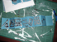
This week I created a few mock up books. It is interesting to see how different they can be by changing the size and format. I think I am begining to get close to exactly what I am aiming for, though both books have had their issues, one is too short, the other too long. I will need to create a third story board in order to try and get the perfect length.

Friday, 23 March 2012

Parts

Not really a lot to say about this post, I sketched out some machine parts in pencil with the idea of scanning them in a layering them over some photographs. However i didn't like how they looked so will not be taking this any further.

Wednesday, 21 March 2012

Third Mock up Book


My Third mock up book, detailing where the text was going to be placed. I had the idea to layer the text over the image in a red circle printed on acetate. In this plan I also introduced a lighthouse, pointing the character in the direction of a plant he needed to protect. I felt previously he had little direction and seemed to be wondering around the city aimlessly until he came upon the plant. I feel this way he has a purpose, and it also make it easier for me to illustrate, as I now have an end goal!

I thought about using the red acetate to mirror the red beam form the lighthouse throughout the narrative. I wanted to keep it as something unknown for a while, making the viewer think it was an angry sunset, or something similar. However, later on in the book you will discover what it is, along with the character. This series of events will lead to a massive explosion and Melpomenia being destroyed.
Text within circle to be printed on acetate.

At the moment, this mock up book is 30 pages long - a lot longer then my previous mock up. I think, however, this is too long and may get repetitive, so I will need to shorten my story and think about which images and scenes I can remove.


Tuesday, 20 March 2012

Studies on recycled paper

Factory Sketch
In my previous project I had used a lot of brown paper as I felt that I would be able to contrast black and white with it. I continued to paint on the recycled paper for a few of my intitial sketches. I was looking at buildings, factories and people. 
Some of the paintings came out ok, using black ink and lots of water worked particularly well for depicting a smog cloud billowing out of a factory.

 I love that the Indian Ink isn't quite water soluble, so I was able to achieve some interesting patterns and texture. I particularly liked this because it was, to a certain extent, incontrolable, and therefore more organic in nature. I liked the idea of mixing the organinc and in-organic, and the particular sketch depicting the factory seemed to incorperate the two.

 Perhaps if I were to re-do the image, I would cut the factory silouhette out of black paper, giving it a very deffinate, straight, man made line, in contrast to the fludi and organic smoke.

For some of my later sketches I decided to use a dark green ink. I used a brush pen filled with water, a little black and some green to get a slightly more opaque colour so I could layer it up. I chose green to try and compliment the organic feel I was aiming for. I think on the brown paper it works well, but lacks some depth and contrast. I feel it would be a good idea to experiment further with white and black in combination with the green midtone.

The images themselves are of the 'robot' character. I was experimenting with adding machine parts inside of the human figure. I felt in the end that less was more and it worked better with a few cogs placed here and there within the human container.


Sunday, 18 March 2012

Second Mock up Book

My Second mock up book showed the layout in more detail. I changed the format to A4, as the previous mock up didn't work. I also included the fold out section and concertina pages.

 I worked on the explosion scene, using a mushroom cloud, however, once I had finished it, I was not pleased with the result. I thought maybe it was a little too cliched.

 I spoke to Pete about it and he felt that I had cut the sotry down too short in comaprison with the amount of images I have made, and also, that the A4 format was possibly not the best approach.


We disscussed making it a large square shape, and how it would probably look more impressive. I will have to think about and re-size my fold out pages, as a square will make them completely different.


Explosion fold out
Explosion fold out


Week 7 Summary

This week I seem to have been completley focused on self promotion. I was so stressed about the whole thing, what with pretty much everything going wrong that could during the production period, that as soon as it was over I got a cold. Great. So my work this week on the Final major Project has been at a stand still, what with pretty much stying in bed. I did however find some interesting things on youtube that I found inspiring;

Invention of Love (2010) - Animated Short Film - Written & Directed by Andrey Shushkov  http://a-shushkof.livejournal.com/


I really loved the style and atmosphere of this animation. In terms of relating it to my project, it is perhaps not dark enough for what I am trying to illustrate, but I love how the scenery is depicted with the only colour being in the sky. 

I also liked the way the cogs moved, as i was intially researching mechanisms to use within my 'robot'. I am pleased I cam across this, it was certainly inspiring!

Friday, 16 March 2012

Presentation Document Tutorial

http://www.webdesignerdepot.com/2009/05/30-artistic-and-creative-resumes/
Today we looked at creative CV's and how to write one. I have to admit to finding most of them over the top and difficult to understand. However, some of them were really beautifully presented. I think that a little creative flair will make an artists CV more interesting then one produced simply in word.

My current CV
I set to creating my own CV, and discovered very quickly that I didn't really have enough information to put on it! Please note that I have also left off my Telephone Number and Address for privacy reasons (I don't want it published on the internet!). I tried to make it as simple as possible, with all of the relevant information detailed, my online portfolio, skills, exhibitions and dates and education. Obviously at this point in time I am expecting to have more exhibitions in the near future that are as of yet, unconfirmed, and will hopefull have some more jobs and learn more skill to update the CV with. I think though this will be alright for now!

I tried to keep it simple in some ways, using illustrations from my self promotion so that whoever I send it too can get a quick idea of how I work. I also added a background paper texture to make it look less flat - probably irrelevant, but I think it looked better!

Tuesday, 13 March 2012

Work In Progress With Jonny and Ceri

I had a fair amount of work to show at this work in progress, I concentrated on discussing my story board plan and showing my sketches of buildings and figures.

Feedback wise, I was told to just keep drawing! I suppose at this point it is perhaps too early to see what my piece will become for them?

Self Promotion Critique

It was interesting to see every ones self promotional pieces on the table at the tutorial. We had Meirion Pritchard from Wallpaper magazine visit the university to give us a critique on our pieces. Would an art director keep hold of your self promotion? or would they put it straight in the bin?

Some of the packaging from the other students was great and really creative. It made me feel that perhaps mine was somewhat uninteresting, as I had just wrapped it in brown paper.
A photo of the letter being prepared before postage.

However when my turn came he thought the packaging was quite nice! My critique was as follows;

  • The string was a bit annoying to open.
  • The Green card I had used to stop the pieces inside from bending looked out of place - perhaps if I had used a more organic looking piece of card, it would have worked better!
  • The bags I had used to package the books, again, didn't work well with the whole organic feel of the promotional pieces and packaging. - I should have left them lose in retrospect, or created a paper sleeve to keep them folded
  • There were too many Items in the pack to look at - I was aware of this, it was a last minute panic of, does this mini book represent me and my work best? maybe, maybe not, so I put in some extra bits.
  • The prints would have looked nice bound together as they looked like a narrative - I agree, I didn't think of it!
There were a lot of points raised, and although they were expressed as tiny points that could be easily rectified, on the whole they liked it. I was very happy as I had been so worried mine would go in the bin!
The points were really helpful and seem so obvious now! I think the main thing I have leaned from it is consistency, and really think about what materials you are using!

Monday, 12 March 2012

Self Promotion Problems

Having drawn and finished all of my self promotional pieces I began to start producing them. I really had some problems with this, primarily with paper quality. In total I had brought 4 different packs of paper, which was not only very expensive, but time consuming as I had to keep going out to find a new stationary shop!
Double sided printing issues, One side is vibrant, the other dull and blurry.

I was quite angry because in 3 out of the 4 cases the sales assistants either had no idea what they were talking about, or just lying to me! The first pack I brought was fantastic, except that it was only coated on one side, so my image came out really bright on one side, and incredibly dull on the other. This was a problem because I wanted to print my self promotional piece as a sheet of double sided A4, so the back would fold out into a larger poster. I tried to find some paper that was coated in this manner on both sides, but this was not to be. The next three packs I brought (from three different stationary shops!) were probably the equivalent of your standard, rubbish, printing paper. I suppose perhaps the brightness was OK, but in comparison to the coated paper it looked very unprofessional.

 I tried to stick Two of the coated paper back to back, but it really didn't work as it needed to be folded multiple times, it was too thick and creased badly. This meant I had to rethink how to present the book.

Sunday, 11 March 2012

Self Promotion finished Pieces

Image 3 - Front and back covers
Image 1 - Mini concertina books
Image 2 - Inside of the book
Image 5 - Front of narrative
Image 4 - Inside of narrative
Here are some pictures of my final images for my self promotion. The Art Directors I chose to send work to were;
Image 6 - envelope
Jo Cochrane from G2
Paul Pensom from Creative Review
Jim Stoddart from Penguin
Lauren Panepinto from Orbital Books
and New Scientist (I could not find an art directors name for this publication).
It took a lot longer to make these then I had planned, mainly because everything kept going wrong! I will discuss the issues in another post dealing with the problems I faced.


Week 6 Summary

This week I have managed to start working through story boards for my book and started to think about the format it will take.
Story board sketch

I feel, however, that I have dedicated far too much time to getting my self promotional pieces looking right. Though they are nearing a finished state now, I feel that this particular section of the FMP is a massive distraction from the main body of work.

Self Promotion piece

 I am the sort of person that likes to do things one at a time. For example, I have to eat each part of a meal separately, vegetable, then meat, never together. This may sound strange, but it's they way I do things, I focus all of my energy on one thing at a time. I feel that the Self Promotion really affected the amount of work I was producing for my narrative. I appreciate I need to learn to balance multiple jobs, I guess the point I'm making is that this time, I couldn't balance the two well at all.

Saturday, 10 March 2012

Self Promotion

I feel I have spent far too much time agonising over my Self promotion Brief. I created a number of images as I felt, after my tutorial with Pete, that my previous selection was not applicable. Here are a selection of sketches used in my self promotion pieces;


I feel that the ink drawings represent my work to a certain degree, so I wanted to keep it all consistent. I felt that hand written text would work better then typed as it was more fitting with the images. I tried to keep it as clear as possible, so I decided to have a typed page at the end just in case the text was difficult to understand.
Hand written text to possibly use
Possible Front cover design 2
Possible Front cover design 1

As mentioned in my previous post, I felt that perhaps the mini contact book didn't represent my art work to its full potential, so I took my book Lines from my previous project and edited it into a concertina style book. I made the images quite small so it would be quite a cute size, but also meant that I could print the whole thing out on an A4 sheet, keeping my production costs down, as I have to send it out to at least 5 art directors!
Mini Concertina version of Lines

Friday, 9 March 2012

Tutorial with Pete

Today we looked through my sketches for my Final Major Project and my self promotion work.

I had previously spoken with Ceri and decided that the format of the fold out A4 mini book for my self promotion worked well, however Pete pointed out that perhaps the content wasn't quite relevant.

 I had chosen some ink drawings from my previous project in the thought that telephone lines suggested communication, the book would fold out into a larger poster with a telephone on the back.
My first self promotional piece

 We decided that it would work better if it were more obvious, so for example, a computer, a mobile phone etc, and also if it told the art director what I actually did.

My re-worked self promotion
I worked on some ink drawings later that day to promote myself and what I do. I prefer this version as it now includes all of my contact details and online portfolio. I feel perhaps in someways the images are a lot more light-hearted then my usual work, so I was slightly concerned that it didn't precisely represent my work. I will begin looking into a second piece to send with this, and use this little book as a business card.


We also discussed my sketches for the FMP which consisted of some building sketches and figure drawing, which I have talked about earlier. Pete suggested it was time to begin putting the story itself together, which I agree with, however I felt that I really needed to work on my reference drawing before I attempted to put them together as I am not so confident in my skills in background images and buildings!

Tuesday, 6 March 2012

First Mock up Book Idea


I had initially wanted to make a long thin book so it resembled a map with fold out pages. However, on making this mock up book I soon realised the format was impraticle and no longer suited the way my narrative had progressed. I will experiment with different formats from now on.

Monday, 5 March 2012

Story Plan


1
2
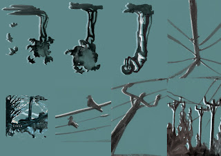
Having worked on some sketches of figures and buildings, and planning a rough story, I began to story board.

 I find it easier to work  on one continuous sheet of paper, this way my flow isn't interrupted during the image making process. I also find that working in this way you are able to build up a rhythm, I hope that this will make my final images more interesting with a good pace.

3
4
The photographs show various sections of this study. I am not sure if it is easily understandable as a narrative without any text, this will be something I will  have to look into.

Some of the images flowed really well and I thought it would be a good idea to include some concertina style pull out pages as well as my fold outs. I feel these will only add to keeping the pace interesting.

found on http://natureanditstransformation.blogspot.co.uk/
5
Image 4 also remind me of the illustrations of the evolution of man. I found this interesting as the narrative is a comment on man, machine and nature, so added an extra scientific hint to the images.

Overall I found the image making and story boarding successful. It my be the case that a lot of the images need to be cut out or refined, I will need to make a mock up book to decide how many pages I should use.