
A Blog by Claudia Whiting documenting my Final Major Project (Southampton Solent, Illustration)
Friday, 18 May 2012
Appendix
Appendix
Lippman, Peter., Paradise Parking collection. http://www.peterlippmann.com/lippmann3/menu.html
Thursday, 17 May 2012

Conclusion
I find it difficult to write a conclusion on this project when The deadline for the Presentation document is before the Degree Show. However, I will list my current thoughts and status.
Having had a tutorial form Ceri on Monday that left me incredibly stressed I am at a stage where my book is still in production. The majority of the images need to be altered in some way, so I am not at a point to say how I think my final piece has turned out.
The place I am at at the moment, I feel, is promising. I think with the adjustments Ceri Mentioned my narrative should reflect the perfect atmosphere I was trying to achieve, and I feel the images, once fully completed will be successful. As I said before though, I don't wish to speculate too much as they could be a complete disaster.
My thoughts on the writing of this blog are mixed. as previously mentioned, at first, I found it incredibly useful to organise my thoughts and look into my research. however, as the project moved on, I found I was spending more and more time trying to keep on top of uploading images and writing my thoughts and analysis of them. I feel that at only 20% of the final grade, the work load outweighs the outcome. I feel like I have spent as much time working on this presentation document as I have my Final Major Project. it is very difficult at time to articulate exactly what you were thinking at the time of producing something, and I feel a lot of my posts have been nothing but a stream of conciseness. Where as some of the posts may be insightful and informative, others are just confusing.
As a whole, we have had a lot of time to complete this project, but there have been so many other outside distractions, including the presentation document, that have left me stressed, confused and generally frustrated. I feel the amount of lectures and seminars we had to attend during this period was a little too much, and would probably have been better if they had been evenly distributed throughout the year.
The same goes for getting a portfolio together, I think it is something that should have been mentioned at the end of the second year and something that was created gradually, then, when we get to this point, all we have to do is drop in some of our latest and greatest images.
The self Promotion was a great exercise, but, as I mentioned before, I spent far too much time working on it and I feel that the early development of my final major project may have suffered for it. I think that if the self Promotion had been a part of the options project, it would have taken some of the load off for this one.
Lastly I would like to comment on how we have been fund raising for the London Show. I feel that the London show is very important, but there have been instances where organising, attending and coming up with ideas have taken over work on the project. I know that some other students who were very active at the begining of the term in fund raising felt that their projects suffered for it. At the end of the day, that was our choice to have a London show, so I can't really complain.
All in all, I have felt very stressed throughout the whole term. I appreciate that it is a stressful time for everyone, but I also feel that the work load has been incredibly large, with so many things to think about it has left me incredibly stressed to the point I am breaking out in eczema, something I haven't had since I was 10.
My conclusion at the moment seems like a lot of anger and negative points. It is not necessarily the case, but it is reflecting how I currently feel.
I know for a fact that I have learnt a lot from this project, and I am pleased with the developments I have made as an Illustrator.
The self Promotion section really made me think about how to represent myself, and also how to present my images to perspective art directors. The feedback we received on the critique was incredibly useful, and it is something I will consider more carefully in the future. It was also useful to research into art directors and decide what exactly we wanted to illustrate.
I was pleased that we had the experience with the exhibition in the Bargate Gallery. It was great to go into an empty room and make it our own. I learnt some valuable lessons on how to hang and present my work, and hopefully this will show in the Degree Show.
As for my project as a whole, despite the stress, I have had some real fun creating images. I was surprised at the direction I took in the end, it was very different form my original statement of intent, and my time plan pretty much fell to pieces within a few weeks! Perhaps I should have kept revising my plan to eliminate the stress, but I felt that setting myself certain targets was more realistic, as you never know where your sketching may take you that day!
I will continue to update this blog after the hand in date, as I would like to see the presentation document as a whole, finished piece in itself. I think it would also be a good idea to add an afterword to this conclusion once my final book is put together!
Week 13 Summary
I have worked long and hard on the images I was intending for my final piece, however I am at a point now where they require a significant amount of editing. I am unhappy at this stage as I had thought I would finish by today, but this is not the case. At least I am in a place that is only editing and production.
Monday, 14 May 2012
Tutorial Ceri
Today we discussed a lot about my project. In short, there were a few points raised that need to be changed;

Remove back ground paintings
Use only collage
Make the scenes darker
Use more of my painted textures
Change the mechanical parts in the figures
Crop more into the figures
Change how I have proposed to set the text
Find a real typewrite instead of using a font
Shorten the story and text.
Right now I am pretty stressed. I know it's not the case, but it feels like I have to change everything I have worked on. I am sure the points raised will improve the overall look of the book, and on some I completely agree. But it is hard to take it all in, I hope I get it right this time round.
Some of the Pages created for the final book
 |
| Page 1 |
I have been steadily creating pages for the final book with all of the components I have made throughout the project. I have been layering images in Photoshop, like a collage, to try and achieve a collage effect.
I feel page 1, however is far too busy, it's like I have all of these pieces to collage with and I have used them all in one go! I will edit this later and make a more simple version!
 |
| Page 2 |
I feel Page 2 is more successful, I have attempted to keep the figure quite abstract for the moment as a silhouette, I hope as the viewer turns the page they will realise that the figure is the mechanical man. It is possible that it is too un-recognisable, perhaps if I refined the silhouette with one of my paper cuts as opposed to the stencil I have used, it may work better.

Page 3 is the introduction of the mechanical man. I have layered some of my photographs of machine parts on top of him, using him as a container. I am please with how the overall image looks, though perhaps it is not dark enough?
Sunday, 13 May 2012
Week 12 Summary
This week I worked on the images in Photoshop. They required a fair amount of adjusting, rotating and re-sizing. Some more examples of completed pages will follow shortly!
I also completed some more collages in order to give my book a more diverse range of buildings.
 |
| Photoshop collage |
I also completed some more collages in order to give my book a more diverse range of buildings.
 |
| Collage to use for buildings |
Saturday, 12 May 2012
Page 9
 |
| Image 1 |
 |
| Image 2 |
Page 9 was completed in the same way as Page 8, however, I think the images are more successful. Image 3 shows the figure filled with wires and other components, all of a sudden he looks more like a robot. I think i will change the rest of the figures to look like this one.
Image 1 I have layered the back of a speaker cone over the figure. It makes the image more abstract, but also, I feel, adds to the industrial feel all the more. I will consider dropping in more of these types of images throughout the book from now on.
 |
| Image 3 |
Page 8

So far it looks pretty close to what I had intended. I will however, go into more detail on my second post about Page 9.
Friday, 11 May 2012
Work in Progress with Derek
Today was a short work in progress, we briefly discussed the direction my project was going in, everything seemed positive.
Monday, 7 May 2012
More Collage


Fourth Mock up book / plan


Sunday, 6 May 2012
Week 11 Summary
This week I created a lot of textures. Pete made me aware in my tutorial that it was time to really start putting everything together. I have to say though i am happy that all components are complete and finished ready to drop into the final book!
Friday, 4 May 2012
Tutorial with Pete
Pete gave me an artist too look at, and helped me make the final decision to use collage for my book. Though I had enjoyed some of the other production methods I had used througout the project, we felt that using my photographs was the best way forward.
Wednesday, 2 May 2012
Forground paintings


Pale Background paintings


I felt that by painting each individual layer separately, I would be able to scan them into photoshop and layer them via the computer. This would give me more room for mistakes and also i can play with darker and lighter contrasts.
Monday, 30 April 2012
Sky Textures

Lights and Explosions


I painted some potential 'lights' for my light house flare. I used inks because I like the translucent effect the have. The red came out as a really vibrant magenta, and, to be honest, I think I prefer this colour to a brilliant red. it is slightly different to what you would expect from light, or and explosion, so I think I will stick with it!
The explosion images were, like the other textures I have created, made with water and ink. I love that they have an organic feel to them, yet also a raw energy, as the mark making is out of my control once the ink touches the water. I think this will work well with my idea of an 'organic' looking explosion!

Textures


Sunday, 29 April 2012
Week 10 Summary
I created some interesting experiments this week, working on the background scenery, textures and depth.
I feel like my weekly summaries have become redundant now. I will keep them short, as the information needed is within all the posts before. I don't want to be just repeating what I have previously said. However I will still link to each week for easy of navigation.
I feel like my weekly summaries have become redundant now. I will keep them short, as the information needed is within all the posts before. I don't want to be just repeating what I have previously said. However I will still link to each week for easy of navigation.
Thursday, 26 April 2012
Collage
 |
| Image 1 - Photo collage and ink |
 |
| Image 2 - Photo collage and ink |
 |
| Image 3 - Photo collage and ink |
Ink, collage and stencil
 |
| Image 1, ink and paper cut |
 |
| Image 2, Ink and paper cut |
 |
| Image 3, Stencil |
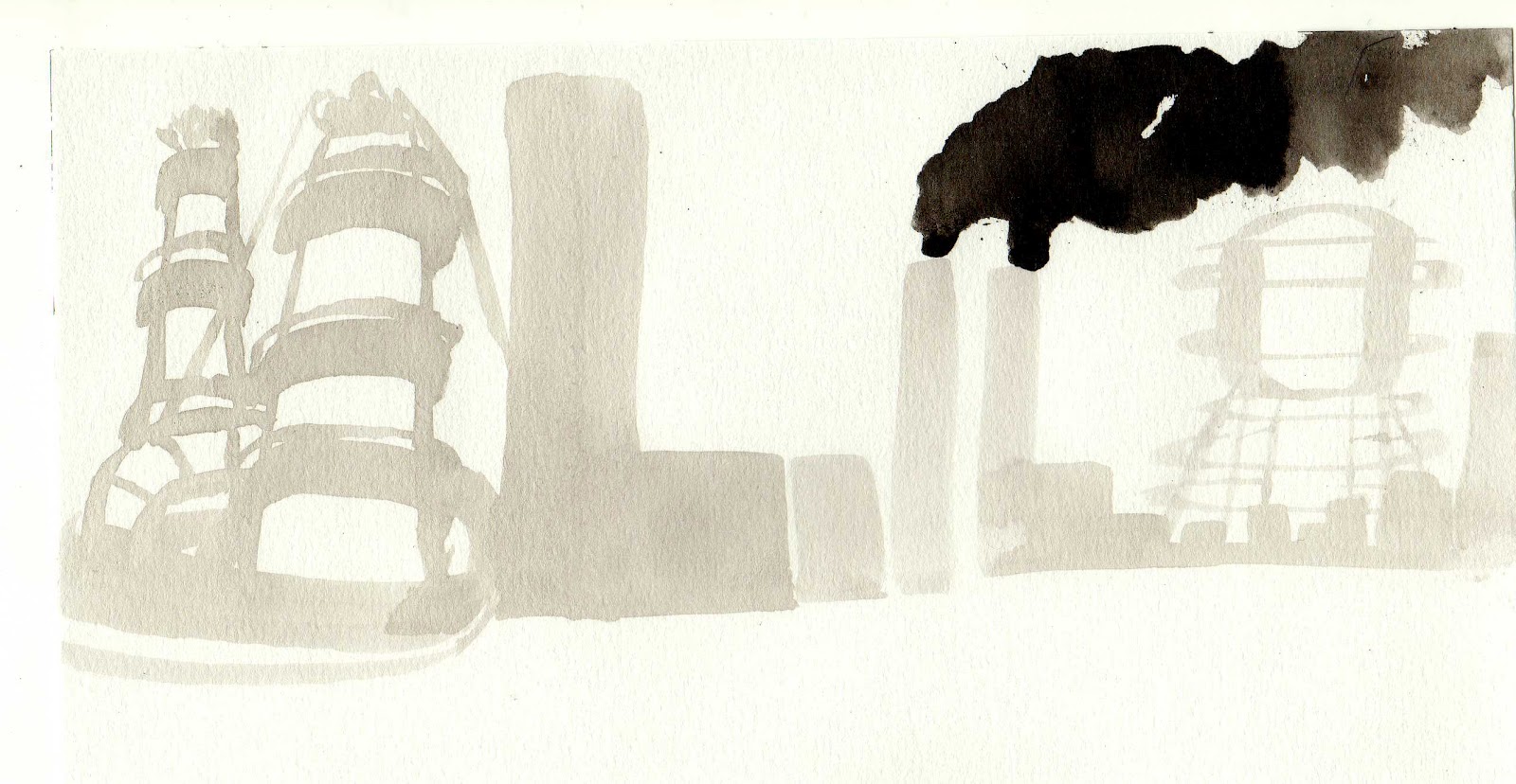
Image 1 is further experiment from one of my earlier sketches. (See earlier post) I decided to cut the buildings out of black paper and collage them onto the ink painting of the smoke. I had previously thought it would give the image a more graphic edge in order to break up the painting within the narrative. I think it works well, the buildings have a definite man made edge to them in contrast to the organic freedom of the smoke.
 |
| Image 5 , stencil |
 |
| Image 4, stencil and ink |
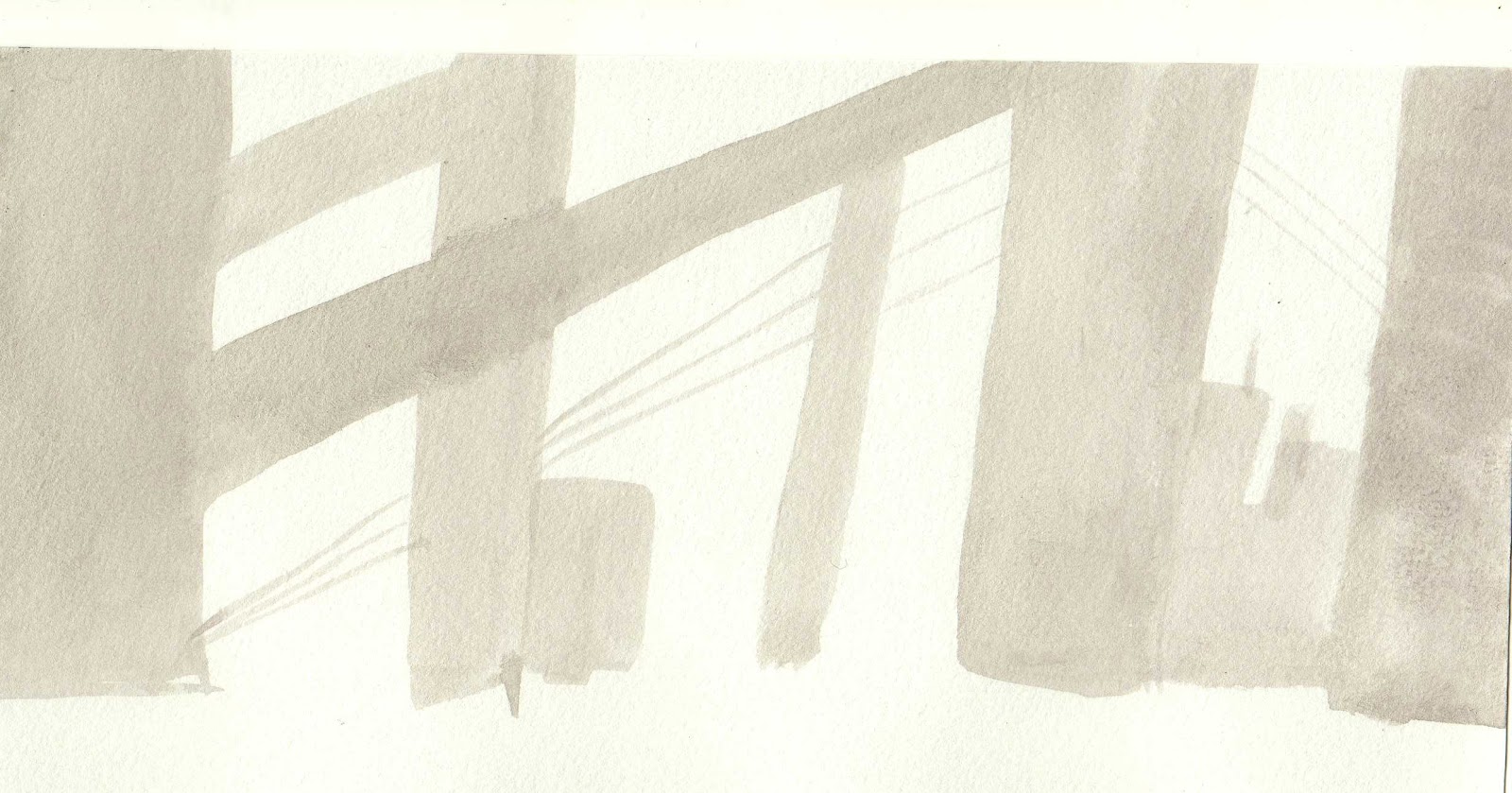
With images 3-5 I experimented with stencils. The idea was to create depth by blurring the buildings that are further in the distance. The stencils created a straight edge, but with some bleeding from the paint they became a little more blurred. The stencils also, I feel, created an industrial feel with their broken edges. They are very messy and only a quick experiment, but I feel it was worth doing as they definitely have the right atmosphere about them.
Wednesday, 25 April 2012
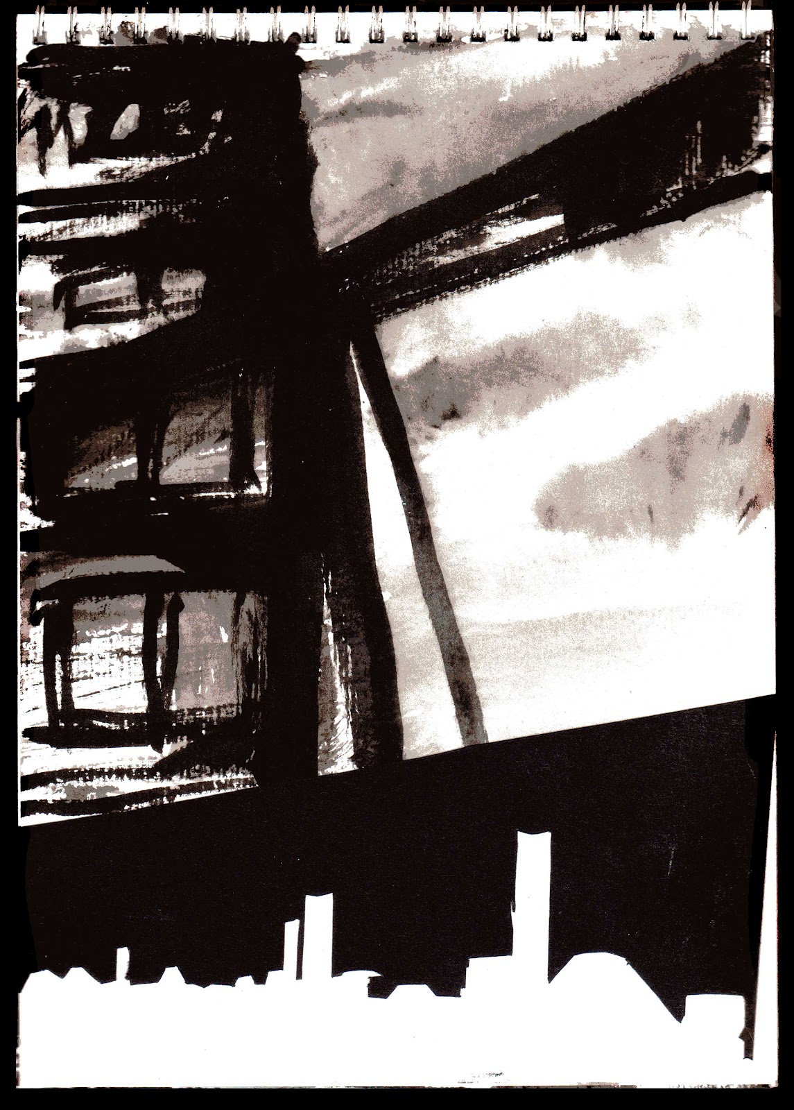
Text and Explosion
 |
| Printer ink on acetate |
 When trying to create my text on a circle on acetate, I realised my printer wasn't capable of printing on it! This led to the ink running everywhere. I thought I would leave it to dry and when I cam back it looked like this! It was almost like a cabbage leaf print! I thought it would perhaps work well as an organic looking explosion, so I printed the ink onto a piece of paper. I later scanned it in and layered it over the top of one of my building paintings. I thought it looked quite impressive, but when printed out the red had lost it's vibrancy and was difficult to see. On discussion with Ceri she said she didn't read it as an explosion at all. I will now try to create some organic looking explosions using inks I think.
Subscribe to:
Comments (Atom)